Like many of you, I love listening to podcasts- especially ones that are about things I’m interested in. One of my very favorite podcasts is Oh Shoot! by Cassidy Lynne – a super talented Michigan based photographer and educator. Yesterday I listened to her newest episode, which was all about color theory.
It’s such a small thing but it’s probably what makes the biggest impact on how photo sessions turn out – right after lighting, that is.
So since it was fresh in my mind I felt like it would be perfect for today’s blog post! Read on for a few seasonal tips on how to pick the best wardrobe options for your next shoot, based on Color Theory!
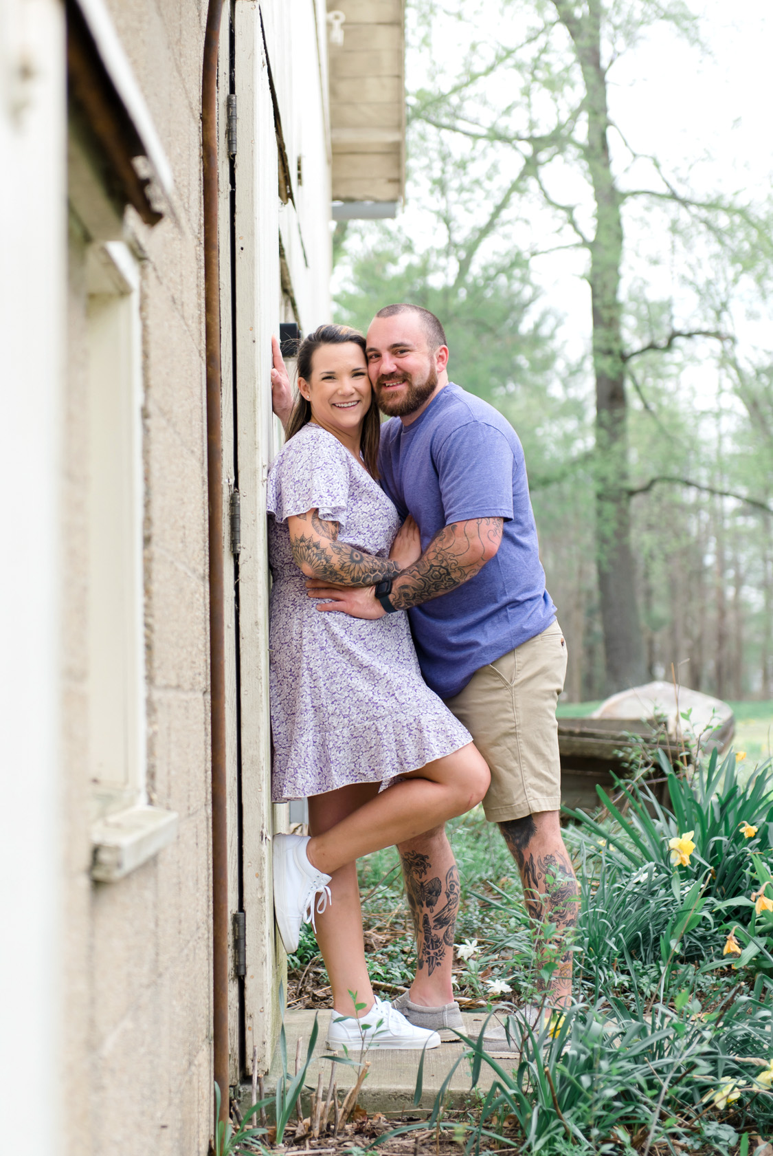
🌸 Spring: Soft, Fresh, and Romantic
Think: Blooming flowers, cool breezes, new beginnings
Best colors:
- Blush pink
- Soft lavender
- Light yellow
- Sage green
- Sky blue
- Creamy neutrals
Why it works: These colors are analogous—they sit next to each other on the color wheel, which creates a gentle, calming palette. Spring light is often soft and diffused, so it reflects lighter tones beautifully.
👗 What to wear: Flowy dresses, pastels, khakis, light-wash denim, floral patterns. Avoid harsh blacks or super bold tones—they can feel too heavy against the gentle spring backdrop.
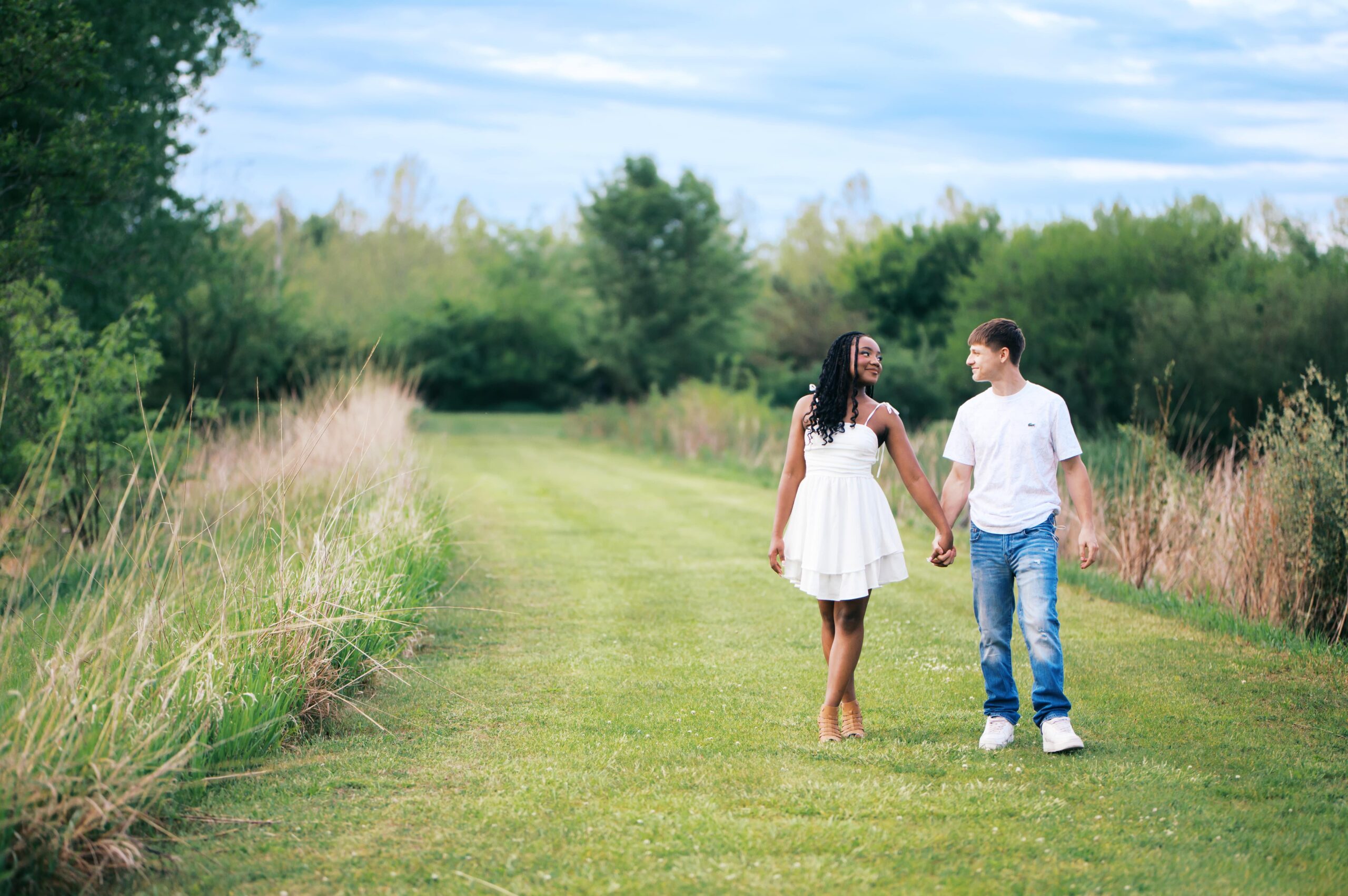
☀️ Summer: Bright, Bold, and Airy
Think: Sunlight, beach days, open skies
Best colors:
- Coral
- Mustard yellow
- Turquoise
- Teal
- Navy
- Crisp white
Why it works: Summer is all about contrast. These complementary colors (like teal + coral) bring energy to your photos and pop against blue skies or golden light.
👕 What to wear: Sundresses, linen shirts, white jeans, chambray, bold accessories. Choose breathable fabrics and don’t be afraid of color—it thrives in summer light!
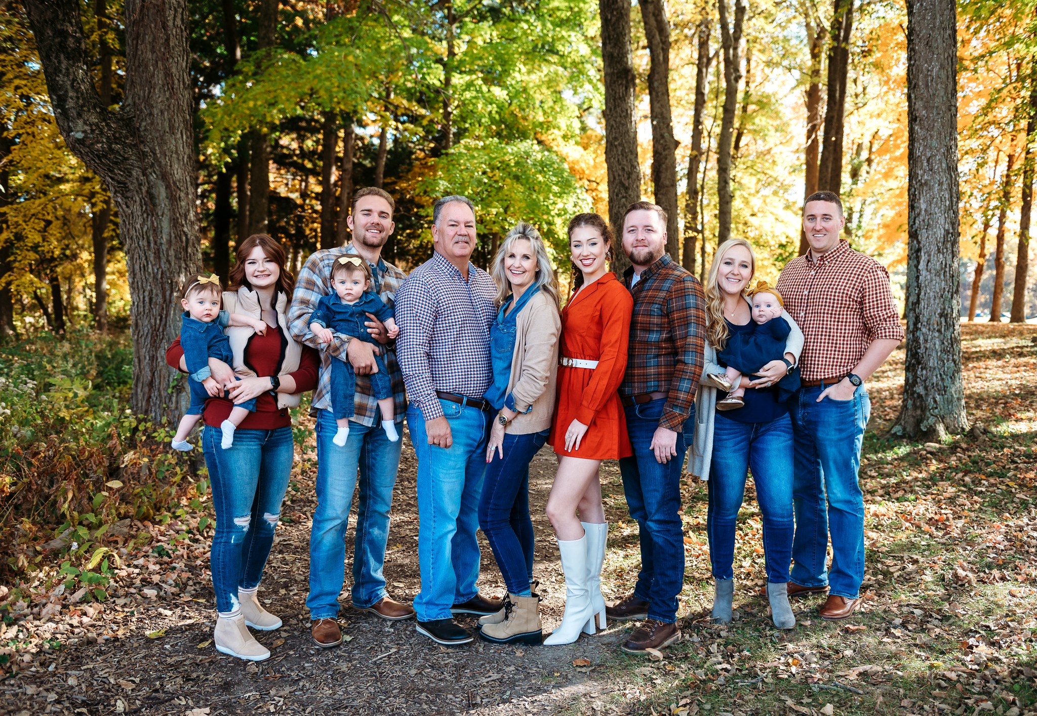
🍂 Fall: Warm, Rich, and Cozy
Think: Leaves changing, warm drinks, golden hour magic
Best colors:
- Rust orange
- Olive green
- Mustard
- Deep navy
- Taupe
- Cream
- Burgundy
Why it works: Fall is a warm color dream. Rusts, mustards, and greens are either analogous or complementary when paired with denim blues, making your whole look feel cohesive with nature.
👢 What to wear: Layers like flannels, knits, boots, and vests. Mix textures to add depth—think denim + suede or flannel + cotton.
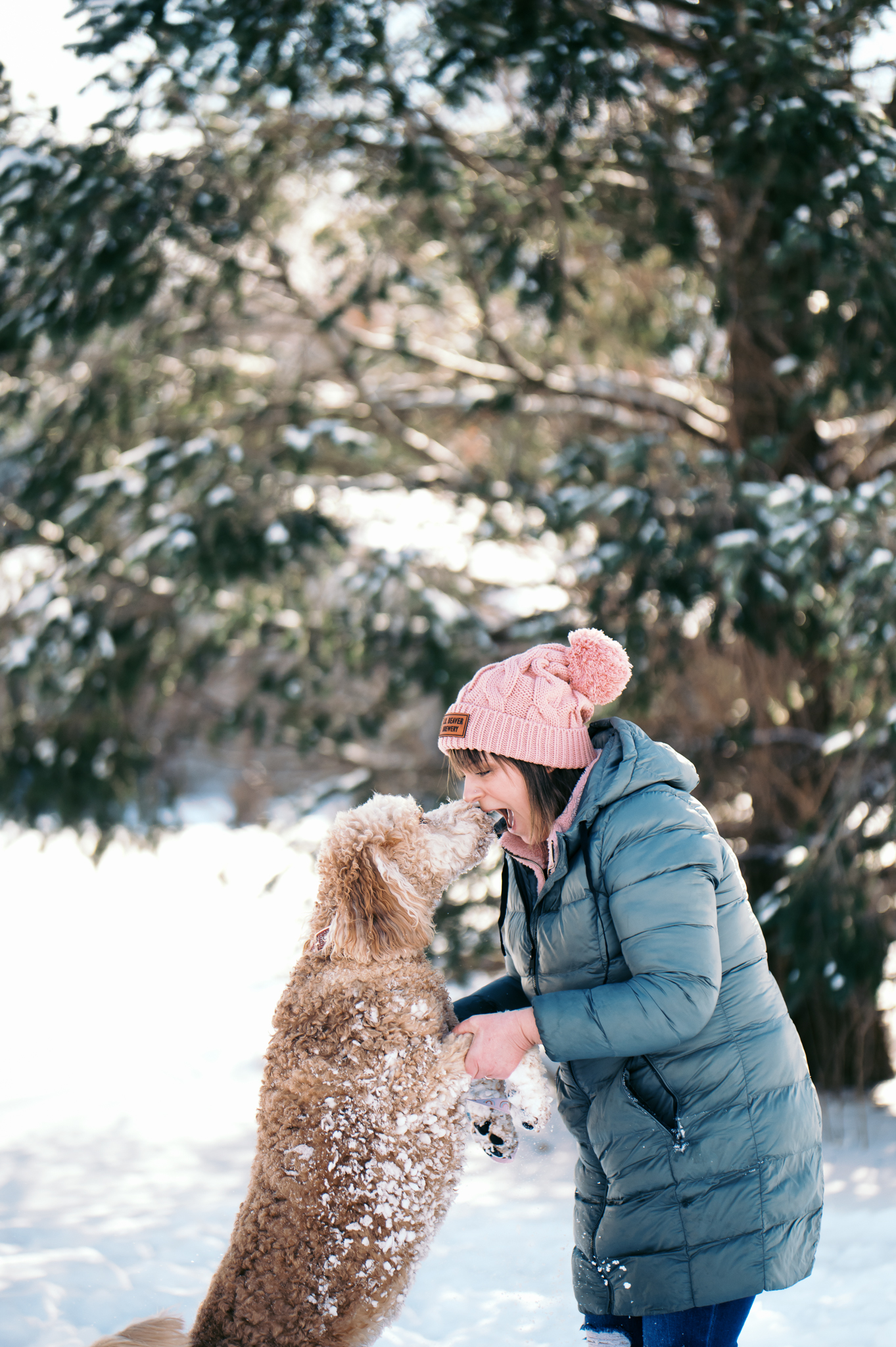
❄️ Winter: Crisp, Neutral, and Elegant
Think: Snowy backdrops, moody skies, twinkling lights
Best colors:
- Deep green
- Burgundy
- Navy
- Cool gray
- Icy blue
- Winter white
Why it works: Winter favors cooler tones and monochromatic palettes. Think depth and contrast—burgundy pops beautifully against snow, and icy blues pair perfectly with moody skies.
🧥 What to wear: Wool coats, scarves, boots, and layers. Avoid neon or overly saturated tones—neutral elegance shines brightest in winter settings.
✨ A Few Universal Tips:
- Stick with 2–3 colors per family or group, and mix in neutrals to ground your palette. Things like boots, belts, and hats in a neutral color (tan or khaki) mixed in with heavier colors like oranges, darker browns and rich blues can help keep the overall scheme from getting too heavy.
- Avoid matching outfits—coordinated is better than identical. Graphic tees/sweatshirts can also kill the vibe! The key here: patterns are great, screen prints are not 🤪
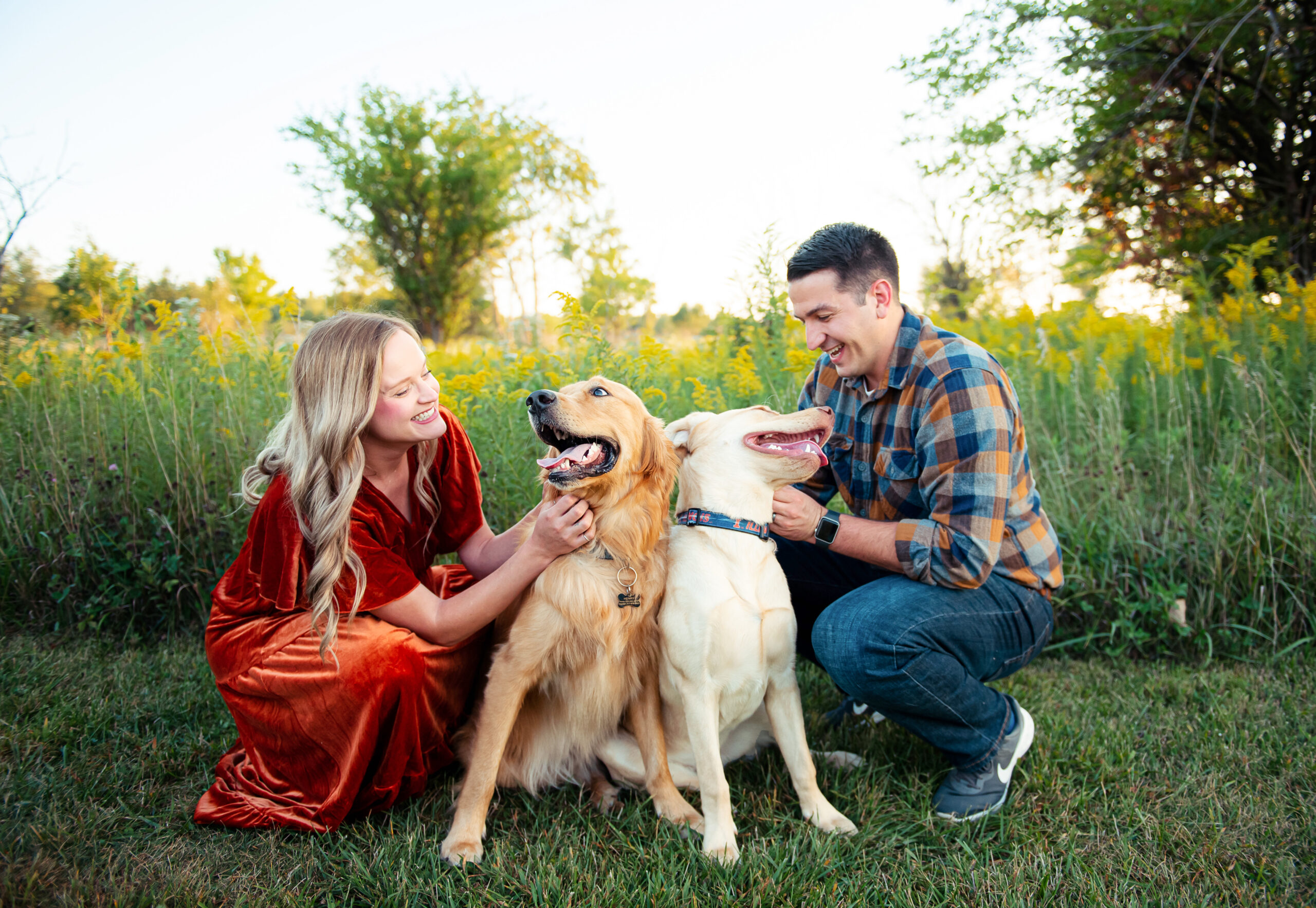
- Think about the location + light of your session. If your background is colorful (like fall leaves), lean more neutral. If your background is neutral (like snow or tall grass), add a pop of color! Having this contrast is what’s going to make your images pop.
- Textures matter: mix knits, denim, cotton, or lace to give visual interest without extra color.
Final Thoughts
Color theory doesn’t have to be complicated…just intentional. The right palette for the season helps tell your story, whether it’s a bright summer senior session or a cozy fall family shoot. And I’m always here to help you style it out if you’re unsure!
May 31, 2025

BE THE FIRST TO COMMENT